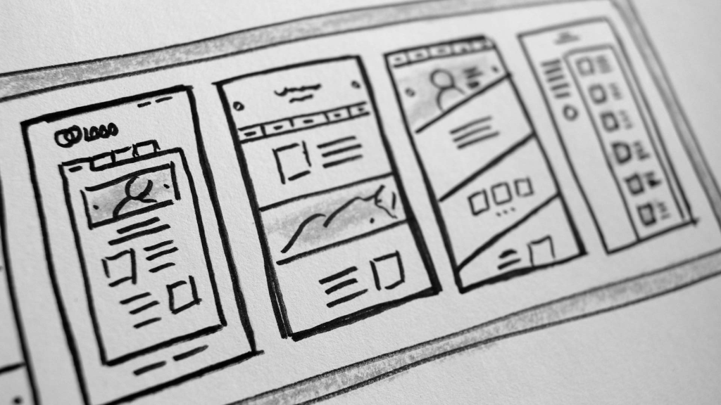
Planning a new website?
Key Points to Consider Before You Begin
1. Define Your Purpose
Every website needs a clear reason to exist.
- Are you building a blog to share insights and attract subscribers?
- Are you offering a product or service and aiming to drive sales or bookings?
Start by defining what you want your site to achieve—and who you want to reach. Knowing your target audience is essential for both content and design.
2. Structure
Think about how users will interact with your homepage. If your goal is to promote a service, ask yourself:
- Does the homepage instantly show what I offer?
- Can visitors quickly find answers like:
Are you available?
How much does it cost?
How do I get started?
Avoid front-loading your site with lengthy “About Us” history. While your company’s background may be meaningful, it shouldn’t distract from the main goal—conversion. A brief mention like “Established 1965” in the header is usually enough.
Start strong. A sample intro might be:
Welcome to [Business Name], proudly serving [Area] since [Year]. We specialize in [Services Offered].
Follow with clear Calls to Action such as:
- Check Availability
- Get a Quote
- Place an Order
Make sure these are prominently displayed on the homepage to guide visitors smoothly.
3. Navigation
User-friendly navigation is essential.
Menus should be intuitive and concise. If you’re selling products, include a clear “Shop” section. Don’t forget essentials like:
- Terms & Conditions
- Returns Policy
- Contact Info (Phone, Email, Map)
Your site should make it easy for users to find what they need without digging.
4. Pages
Every page should have a clear, relevant title that reflects its content.
Example: A page titled “Find Us” should include:
- Address & map
- Directions
- Parking info
- Contact details
Avoid off-topic content. Think like a first-time visitor—make everything logical and easy to access.
5. Use High Quality Media
Media includes images, videos, PDFs, and audio.
High-quality visuals enhance credibility. If you’re providing your own photos, keep in mind:
- Lighting: Use natural light outdoors; use sufficient lighting indoors.
- Framing: Keep your subject fully in frame to allow flexible cropping.
- Distractions: Ensure the background is clean and uncluttered.
- Team Photos: Use a neutral background for clarity and consistency.
If needed, consider hiring a professional photographer.
6. Choose Colours thoughtfully
Colour plays a vital role in both branding and usability.
Use colour to:
- Align with your brand identity
- Highlight buttons and links
- Break up sections on a page
- Differentiate headings from body text
Keep your palette consistent across the site.
7. Select Appropriate Fonts
Fonts set the tone for your site.
- Use a professional, easy-to-read font for body text.
- Pair it with a complementary font for headings.
- Avoid using too many fonts—two per site is generally ideal.
Example: A playful font might suit a childcare site, but not a law firm.
8. Using WordPress
WordPress makes updating your website simple—if you know how to use it.
WordPress.org offers free tutorials and lesson plans covering:
- Editing content
- Uploading images
- Creating new pages and blog posts
You can also find helpful video guides on YouTube. If you’d like recommendations or guidance, feel free to reach out.